Highlights Cover for Instagram: Dimensions, Ideas, and Design Tips (2026)
Your highlights are the first bit of real design space on your Instagram profile. They sit directly under the bio, they survive long after a story has expired, and a consistent set of covers is often what makes a profile feel "put together" before anyone scrolls the grid.
The good news: making a great set of highlight covers is not a design skill problem. It's a dimensions-and-details problem. Once you know the correct canvas, the circular safe zone, and a handful of small tricks — the blank-space look, neutral naming, clean grouping — you can put together a cover set in one afternoon and never touch it again. This guide walks through everything you need, from the exact pixel specs to ten aesthetic directions to a few naming conventions that keep the look tidy. If you want to understand what goes inside the highlights themselves, pair this with our companion guide on how to create killer Instagram stories.
Quick answer
- Canvas size: 1080 × 1920 px (the standard story size).
- Safe zone for the circular crop: roughly a 500 × 500 px square centered in the frame. Anything outside that square will be hidden.
- Two ways to set a cover: pick a frame from an existing story, or upload a custom image you designed elsewhere.
- The upload trick: design the cover in any tool (Canva, Adobe Express, Figma, Procreate), save it as a 1080 × 1920 image, then pick it from your camera roll when you name the highlight.
- Name length: up to 15 characters. Emojis count. Blank-looking Unicode characters can fake an "empty" label.
- Keep it short: six to ten highlights is usually the sweet spot before the row starts to scroll.
What highlights actually are
Before the design talk, a quick recap, because people still confuse the two features.
A story is a photo or short video that lives on your profile for twenty-four hours and then disappears. A highlight is a permanent collection of past stories, pinned as a circular icon directly beneath your bio. When someone taps a highlight, they scroll through those stories in order. Unlike regular stories, highlights never expire on their own — they stay up until you remove them.
If a new story isn't picking up viewers in its first hour, you can give it an early push with free Instagram story views — real viewers land on your latest active story within minutes, before it expires or gets archived into a highlight.
Because they sit at the top of your profile, highlights are prime real estate. They tell visitors what you're about in a single row of icons: what you offer, who you've worked with, what your world looks like. A good highlights cover for instagram set gives that row a clear visual identity instead of leaving it as a jumble of screen grabs.
How to create a highlight and add a cover
The flow is almost identical on iOS, Android, and the desktop web, with one difference: you cannot create or edit highlights on desktop. Everything below happens in the mobile app.
From your profile, tap the "+ New" button that appears as a circle with a plus sign at the end of your highlight row, or tap the plus icon in the top corner and choose Highlight. Instagram shows your story archive. Pick one or more stories you want to include and tap Next.
On the next screen you'll see two fields: the highlight name (up to 15 characters) and the cover image. By default, Instagram picks a frame from the first selected story. You have two options:
- Edit cover → browse frames from any of the selected stories and drag the crop circle to the part you want visible.
- Camera icon on the cover preview → upload a custom image from your camera roll.
The upload route is the one most designers use: build a custom 1080 × 1920 cover in a design tool, save it to your phone, and pick it here. You don't need to have posted it as a story first — the upload goes straight from your camera roll into the cover slot.
To change a cover later, long-press the highlight on your profile, choose Edit Highlight, and repeat the process. You can also rename it, add or remove stories, or delete the highlight entirely from that menu.
Dimensions and the circular safe zone
This is where most first covers go wrong. The full canvas is a vertical rectangle, but the profile only ever shows a circular crop of a small area near the center. If your icon is positioned where it would look good in a story, it's going to be cut off in the cover.
| Spec | Value |
|---|---|
| Upload canvas | 1080 × 1920 px (9:16) |
| Rendered as | Circle, roughly centered |
| Safe zone for content | ~500 × 500 px box centered in the canvas |
| Recommended icon size | 250–400 px wide, centered |
| File format | JPG or PNG, under 4 MB |
| Color space | sRGB |
A simple way to design reliably: open a 1080 × 1920 canvas, place a 500 × 500 guide square dead center, and build your icon inside that square. Keep the background a solid color (or a very soft gradient) that fills the entire canvas. Whatever is outside the square is invisible on the profile, so don't put anything important there.
The blank-space trick
The single most common request from people redesigning their highlights is the blank space for instagram highlights look — a row of covers that are almost empty, so the profile reads as quiet and minimal instead of loud and busy.
The effect is simple to build:
- Create a 1080 × 1920 canvas with a solid color background. The most popular choices are off-white, beige, warm cream, soft black, or a muted pastel that picks up one accent color from your brand.
- Place a single small element in the exact center — a thin line icon, a tiny letter-like symbol, or nothing at all.
- Export and upload the image as the cover.
If you want the cover to look completely blank — no icon at all — just upload the solid color image. On a white profile background your highlights will almost disappear into the page, leaving only the highlight names beneath. Paired with short, neutral names (or no name at all, using a blank Unicode character — more on that below), this is the look you've seen on clean editorial creator profiles.
A word of warning: blank covers lean hard on your profile picture and bio to carry the personality. If you're a business, make sure visitors can still tell what you do from the bio alone. For pointers, our guide to writing an Instagram bio that converts covers structure for personal and creator accounts, and this one for men's bios is useful if the profile leans masculine.
10 aesthetic styles to try
If "minimal blank space" isn't your thing, there's a whole range of directions that still feel coherent. Here are ten styles to pick from — mix at most two in a single row for a unified look.
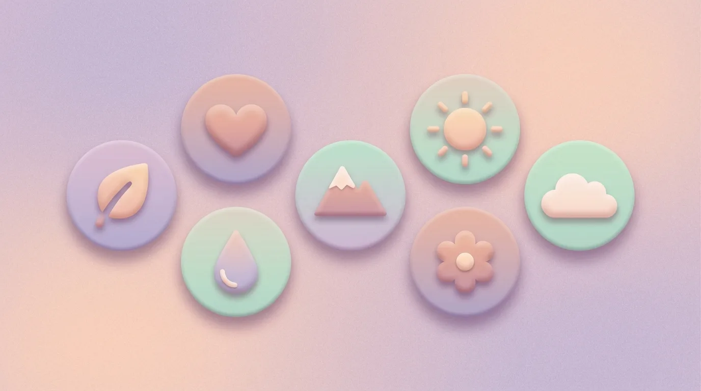
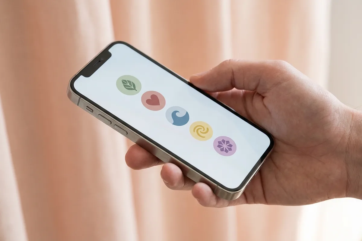
- Pastel icon set. Soft peach, mint, lilac, butter yellow backgrounds with a single thin line icon (camera, book, coffee cup, plane). Warm and inviting, works for lifestyle, coaching, and wellness.
- Line-drawing illustrations. One-color outline drawings on a neutral background — think hand-drawn flowers, faces, or objects. Editorial and personal.
- Monogram letters. A single capital letter or two-letter monogram centered on a textured background. Clean branding for consultants and freelancers.
- Color-block. Solid blocks of brand color with no icon at all. The names do all the work. Great for bold brands with a strong palette.
- Polaroid frames. A photo inside a white square "frame" with a little bottom margin. Nostalgic, good for travel and photography accounts.
- Handwritten scribbles. A quick ink doodle in the center — a squiggle, a heart, a star — over an off-white background. Playful, personal, works for creators and makers.
- Gradient orbs. A soft gradient sphere filling the circle. No icon, just color. Futuristic and calm, fits wellness, tech, or music profiles.
- Photo-as-cover. A cropped, zoomed-in photo of a signature object or color. A single bloom, a coffee cup, a texture. Looks best when all covers share a color temperature.
- Paper and texture. Backgrounds made from scanned paper, linen, or watercolor wash, with a small icon on top. Warm and tactile.
- Emoji on solid color. A single emoji, large and centered, on a pastel background. The fastest style to execute — no design skills needed — and it reads clearly at small sizes.
Designing a cover in a free tool
You don't need a paid design suite. The workflow is the same in Canva, Adobe Express, Figma, Procreate, or any basic vector app:
- Create a new document at 1080 × 1920 px.
- Fill the background with a single color or gradient.
- Add a centered guide — a 500 × 500 px square at the exact middle of the canvas.
- Drop your icon, photo, or text inside that square.
- Export as PNG or JPG.
- AirDrop, email, or cloud-sync the file to your phone.
- In Instagram, create or edit the highlight, tap the cover preview, and upload from camera roll.
Repeat for each cover, changing only the icon. Keeping the canvas, background, and icon style fixed across every cover is what makes the row look intentional.
Naming conventions
The cover is half the look — the name underneath is the other half. Instagram gives you fifteen characters. That's enough for a short word or two, but not a sentence.
A few conventions that keep the row tidy:
- Use one word per highlight when you can. Travel, Food, Reviews, FAQ, Links.
- Decide once on capitalization. All lowercase feels softer and more editorial. Title Case feels more professional. Mixing them in the same row looks accidental.
- Emojis count as characters. One emoji at the end of a short word (e.g. "Travel" with a plane) is fine. A string of three or four emojis eats your budget and usually looks cluttered at small sizes.
- Blank names. If you want the cover to stand alone without a word beneath it, paste a single invisible Unicode character (the Hangul Filler or a zero-width space, widely known as the "blank name" trick) into the name field. Instagram accepts it and renders the label as empty. Use it sparingly — if every highlight has a blank name, visitors won't know what any of them contain.
Organizing the row
Beyond individual covers, the order of your highlights matters. Instagram shows them newest-first by default, which means the last highlight you updated jumps to the left. To control the order:
- Tap and hold any highlight on your profile.
- Choose Edit Highlight, then back out — the highlight will have been bumped to the front.
- To push a highlight further back, add any story to a highlight you want in front of it (this re-sorts the row).
There's no drag-to-reorder on a mobile profile, which is why most creators batch-update their highlights in reverse order of where they want them to appear.
As for what to put in them, a few patterns work for almost any account:
- Group by theme. Travel, food, behind-the-scenes, FAQ, reviews, press. Each highlight is a self-contained mini-feed.
- Rotate seasonal highlights. A "Summer 2026" or "Launch Week" highlight can sit at the front for a month and then be archived later.
- Pin your pillars. The three or four topics you most want to be known for should always live in the first visible slots.
For pairing this with a stories strategy, see our guide to Instagram stories link stickers — most of those sticker tactics turn a casual highlight into a small conversion funnel.
Using highlights for lead generation
If your profile does any kind of business — coaching, freelancing, a product, a service, a newsletter — a few highlight slots should earn their keep.
- FAQ highlight. Answer your five most-asked questions, one story per answer. Reduces your DM load and pre-qualifies leads.
- Book a call / links highlight. A short intro story plus a link sticker pointing to your booking page, shop, or email capture. Pairs especially well with the tactics in our link-sticker playbook.
- Testimonials highlight. Screenshots or short clips of customer praise. Social proof visitors can scroll through in thirty seconds.
- Process / portfolio highlight. For service providers, a mini case-study highlight — before, during, after — is often more convincing than your grid.
- About me highlight. A two-or-three-story introduction for first-time visitors who don't want to dig through the grid to figure out who you are.
These are the highlights that justify the time investment. Cover design matters, but a beautiful empty highlight helps no one. A solid caption under the videos inside the highlight does more for conversion than any icon.
Common mistakes
A few easy ways to make a highlight row look worse than it should:
- Low-contrast icons. A white line icon on a cream background disappears at the thumbnail size the profile actually displays. Test every cover by looking at the row from arm's length on your phone.
- Too many highlights. Anything past ten covers starts to require horizontal scrolling, which most visitors never do. Keep the essentials up front and archive the rest.
- Inconsistent styles. Two pastel icon covers, one photo cover, one neon gradient, and one polaroid — the row reads as chaos. Pick one style per refresh.
- Important content outside the safe zone. The text at the top or bottom of a 1080 × 1920 canvas vanishes in the crop. If your first try looks cut off, the content is too close to the edge.
- Rebranding half the row. If you're redesigning, do all of them in one sitting. A row where the first three covers look new and the last four look old is worse than either version on its own.
- Using screenshots as covers. Auto-picked story frames usually have UI elements, caption stickers, or awkward crops in the center of the circle. Either upload a clean custom cover or pick a frame that's visually quiet.
FAQ
What size should a highlight cover be? 1080 × 1920 pixels, the same as a story. Keep the important part of the image inside a 500 × 500 box centered in the canvas, because the profile crops it to a circle.
Can I change a highlight cover without posting a story? Yes. When creating or editing a highlight, tap the cover preview and choose the camera-roll icon — you can upload any image from your phone without posting it as a story first.
Why does my cover look cut off? The content is outside the circular safe zone. Move the icon or subject closer to the exact center of the 1080 × 1920 canvas and re-upload.
How many highlights should I have? Six to ten is the sweet spot. Anything past ten forces visitors to scroll sideways, and most won't. Pin the most important ones in the first three slots.
Can I reorder highlights? Not by drag. The row sorts by most-recently-updated, so to bring a highlight to the front, add any story to it or edit it and back out.
Do blank-name highlights still work? Yes. Pasting a zero-width Unicode character into the name field creates an empty-looking label. Use it sparingly — if every label is empty, visitors can't tell the highlights apart.
Can I edit highlights from desktop? No. Creating, editing, and reordering highlights is mobile-only. You can view them on desktop, but the edit options only appear in the app.
Wrap-up
A great highlights cover for instagram set isn't about being a designer. It's about picking one visual direction, laying out a correct 1080 × 1920 canvas with content inside the circular safe zone, and repeating the template across every cover. Do that once, write short clear names underneath, and you're done for months.
If you want to tie the whole profile together, pair this with our deeper guides on creating killer Instagram stories and using link stickers to convert profile visitors. And if your bio itself still needs work, our Instagram bio generator is a quick way to tune the copy that sits right above those freshly designed covers.
Related Posts
- How to Create Killer Instagram Stories
- 10 Ways to Use Instagram Stories’ Stickers
- Tips To Make Creative Captions for Instagram Content
Dziękujemy ❤️ za przeczytanie Bloga Hiketop+
Oprócz publikowania interesujących artykułów, oferujemy platformę wymiany, która umożliwia uzyskanie autentycznych obserwujących na Instagramie bez żadnych kosztów. Miliony wypróbowały Hiketop+, aby promować swoje profile. Odkryj naszą darmową aplikację dostępną zarówno na iOS, jak i Android, aby zwiększyć swoje polubienia, obserwujących i komentarze na Instagramie.